KŪKAI
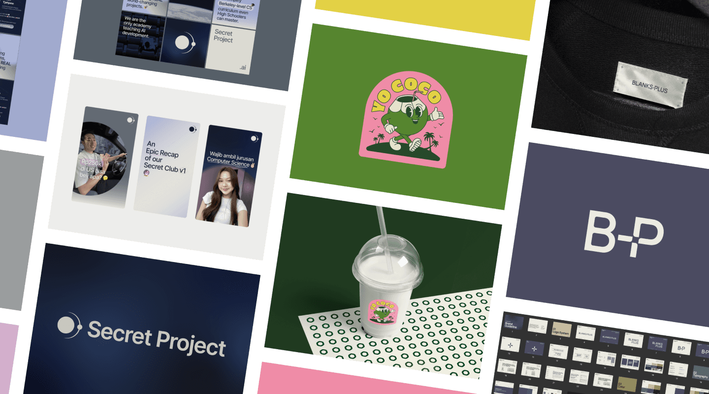
KŪKAI
KŪKAI
SERVICES
SERVICES
SERVICES
Logo Design
Logo Design
Naming Consultancy
YEAR
YEAR
YEAR
2024
2024


THE CLIENT
THE CLIENT
KŪKAI is an Indonesian fashion retailer offering everyday wear with a hint of casual elegance. They craft high quality, affordable, and timeless pieces for women, men, and kids.
THE BRIEF
THE BRIEF
The brief was to develop an abbreviated name for KŪKAI, an already established brand, that would serve as a modern and versatile extension of its identity. The goal was to create a flexible expression suitable for digital platforms, product labels, and more casual marketing touchpoints. This also included designing a logo variation to visually represent the abbreviated form.
THE STORY BEHIND THE NAME
THE STORY BEHIND THE NAME
THE STORY BEHIND THE NAME
K&Ū, is a symbolic abbreviation, with K representing the brand and Ū symbolizing the customer. It is designed to maintain the integrity of KŪKAI while making space for a more personal, everyday connection.
THE BRIEF
The brief was to develop an abbreviated name for KŪKAI, an already established brand, that would serve as a modern and versatile extension of its identity. The goal was to create a flexible expression suitable for digital platforms, product labels, and more casual marketing touchpoints. This also included designing a logo variation to visually represent the abbreviated form.
THE CLIENT
KŪKAI is an Indonesian fashion retailer offering everyday wear with a hint of casual elegance. They craft high quality, affordable, and timeless pieces for women, men, and kids.
THE BRIEF
The brief was to develop an abbreviated name for KŪKAI, an already established brand, that would serve as a modern and versatile extension of its identity. The goal was to create a flexible expression suitable for digital platforms, product labels, and more casual marketing touchpoints. This also included designing a logo variation to visually represent the abbreviated form.
THE RESULT
THE STORY BEHIND THE NAME
K&Ū, is a symbolic abbreviation, with K representing the brand and Ū symbolizing the customer. It is designed to maintain the integrity of KŪKAI while making space for a more personal, everyday connection.
THE APPROACH
THE APPROACH
THE APPROACH
This approach explores a fusion of KŪKAI’s established heritage with a modern, minimalist aesthetic. The design process focused on expressing themes of inclusivity and connection through intentional emphasis on the letterforms “K,” “Ū,” and the ampersand.
This approach explores a fusion of KŪKAI’s established heritage with a modern, minimalist aesthetic. The design process focused on expressing themes of inclusivity and connection through intentional emphasis on the letterforms “K,” “Ū,” and the ampersand.
The RESULTS
THE RESULTS
THE RESULTS
THE RESULTS
By experimenting with their configuration and interaction, the logo becomes a visual representation of unity, reflecting the relationship between the brand and its audience. The result is a fresh, versatile logo variation that feels approachable, while staying rooted in the brand’s established identity.
By experimenting with their configuration and interaction, the logo becomes a visual representation of unity, reflecting the relationship between the brand and its audience. The result is a fresh, versatile logo variation that feels approachable, while staying rooted in the brand’s established identity.